books2024 <- read.csv("books2024.csv")The tidyplots package is a relatively new addition to the R ecosystem, designed to streamline the creation of publication-ready plots for scientific papers. Built on top of ggplot2 and its extensions, it aims to provide a more consistent syntax and handy convenience functions for generating common plot types - especially those that typically require multiple steps in ggplot2.
I’ve been meaning to give tidyplots a try for a while, and I finally managed to come up with an excuse: analysing my 2024 reading habits. To do this, I exported my Goodreads library and created a dataset of the books I read last year. I also manually added the language in which I read each book. I’m sharing the results from my experiments with tidyplots here. If you’d like to follow along, you can download the dataset here.
First, let’s take a look at a summary table created using the ivo.table package:
library(dplyr)
library(ivo.table)
books2024 |>
    select(My.Rating, Language) |>
    ivo_table(rowsums = TRUE, colsums = TRUE)
My Rating | ||||||
|---|---|---|---|---|---|---|
Language | 1 | 2 | 3 | 4 | 5 | Total |
English | 2 | 7 | 11 | 5 | 4 | 29 |
German | 0 | 0 | 4 | 2 | 3 | 9 |
Norwegian | 0 | 0 | 0 | 0 | 1 | 1 |
Swedish | 4 | 7 | 18 | 19 | 6 | 54 |
Total | 6 | 14 | 33 | 26 | 14 | 93 |
From the table, we can see that I read a total of 93 books in 2024. I mostly read in Swedish and English, but also read some books in German and Norwegian. I rated 73 books 3 stars or higher, which means I had a pretty solid reading year - lots of enjoyable books!
A doughnut chart showing language distribution
Doughnut charts aren’t as common as their better-known cousin the pie chart. I don’t use them often myself, but wanted to try one here. In case you haven’t seen one before, a doughnut chart is basically a pie chart with a hole in the middle. This makes the chart easier to read, as counts are represented by segment length (which is linear) rather than area (which is non-linear, and can be misleading). Of course, tidyplots insists on using the bastardised American spelling - donut. 🙃
library(tidyplots)
books2024 |>
    tidyplot(colour = Language) |>
    add_donut() |>
    remove_title()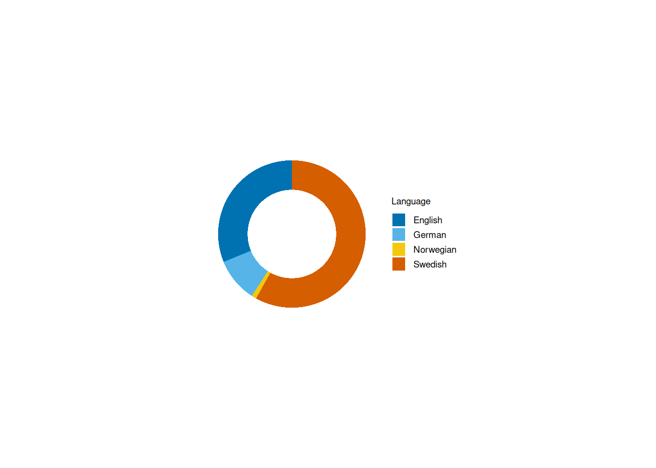
You might notice that there’s quite a bit of whitespace around the plot. This happens even when viewed in RStudio:
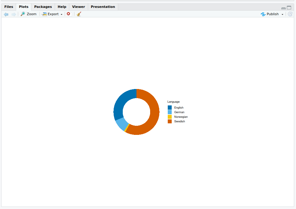
I’m not entirely sure why this is the default in tidyplots, but it does feel excessive. Thankfully, we can fix it using adjust_size(). By default, the plot area is set to 50×50 mm, but increasing it to 100×100 mm makes a noticeable improvement:
books2024 |>
    tidyplot(colour = Language) |>
    add_donut() |>
    remove_title() |>
    adjust_legend_title() |>
    adjust_size(width = 100, height = 100)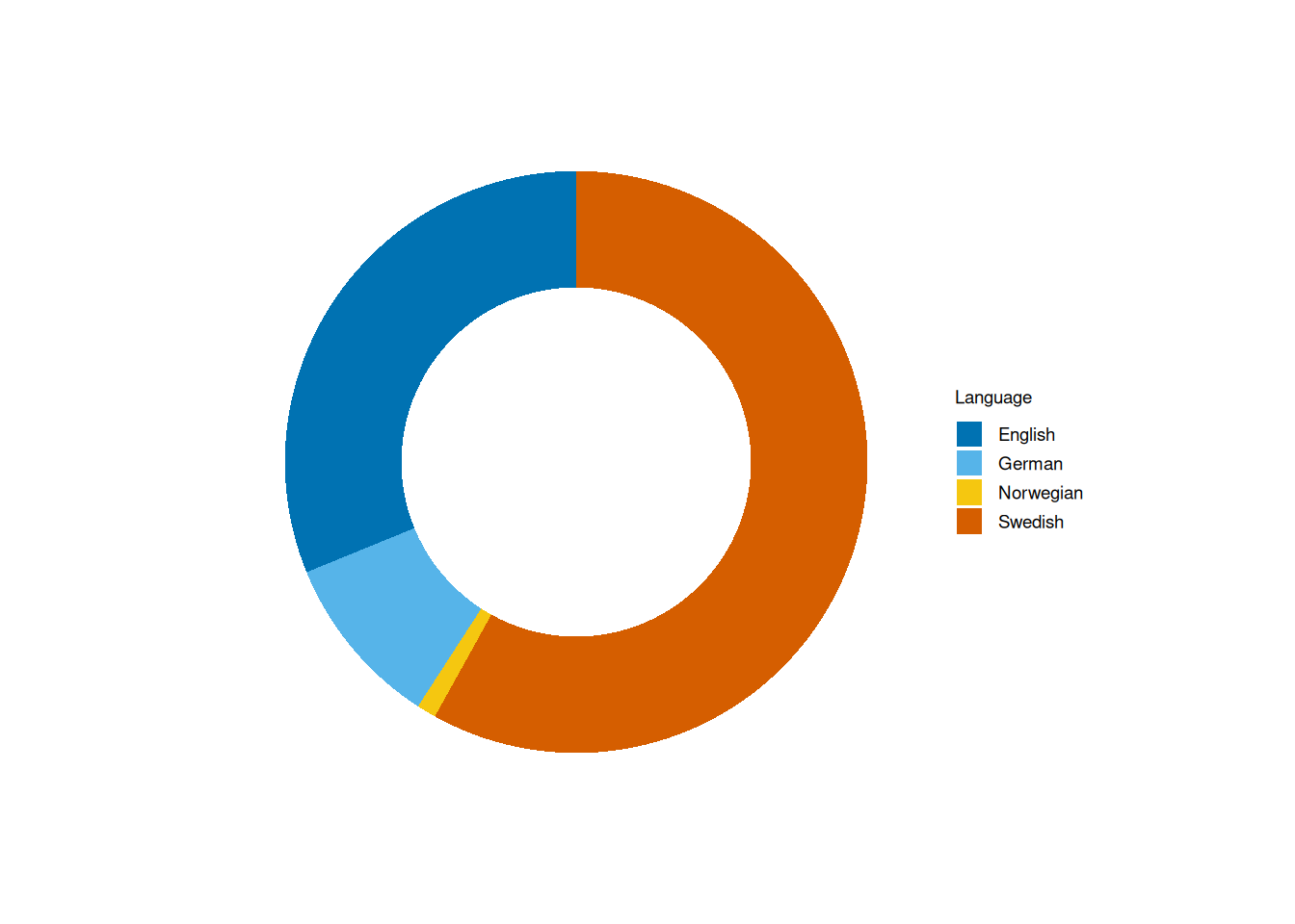
Note, however, that the legend isn’t rescaled with the rest of the plot.
Barcharts and multiple subplots
Let’s take a look at how I rated my 2024 reads, breaking them down by language. We’ll start with a stacked bar chart:
books2024 |>
    mutate(My.Rating = factor(My.Rating)) |>
    tidyplot(x = Language, colour = My.Rating) |>
    add_barstack_absolute() |>
    adjust_legend_title("Rating") |>
    adjust_size(width = 100, height = 100)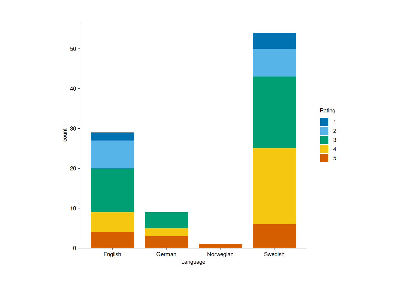
To make the chart more intuitive, I’d prefer to have the highest-rated books at the top of each bar. We can achieve this by reversing the color scale:
books2024 |>
    mutate(My.Rating = factor(My.Rating)) |>
    tidyplot(x = Language, colour = My.Rating) |>
    add_barstack_absolute() |>
    reverse_color_labels() |>
    adjust_legend_title("Rating") |>
    adjust_size(width = 100, height = 100)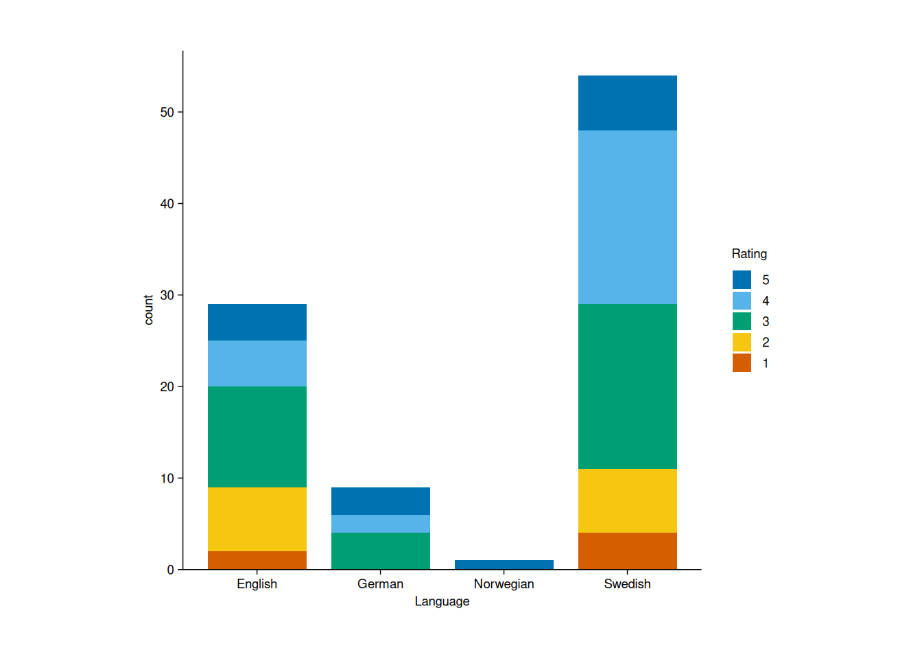
Note that the default y axis title here is “count”. Since the purpose of the package is to create publication-ready plots, I think “Count” would have been a better choice.
If we want to visualize the same data using doughnut charts, we can create a facetted doughnut plot by language using split_plot():
books2024 |>
    mutate(My.Rating = factor(My.Rating)) |>
    tidyplot(colour = My.Rating) |>
    add_donut() |>
    split_plot(Language)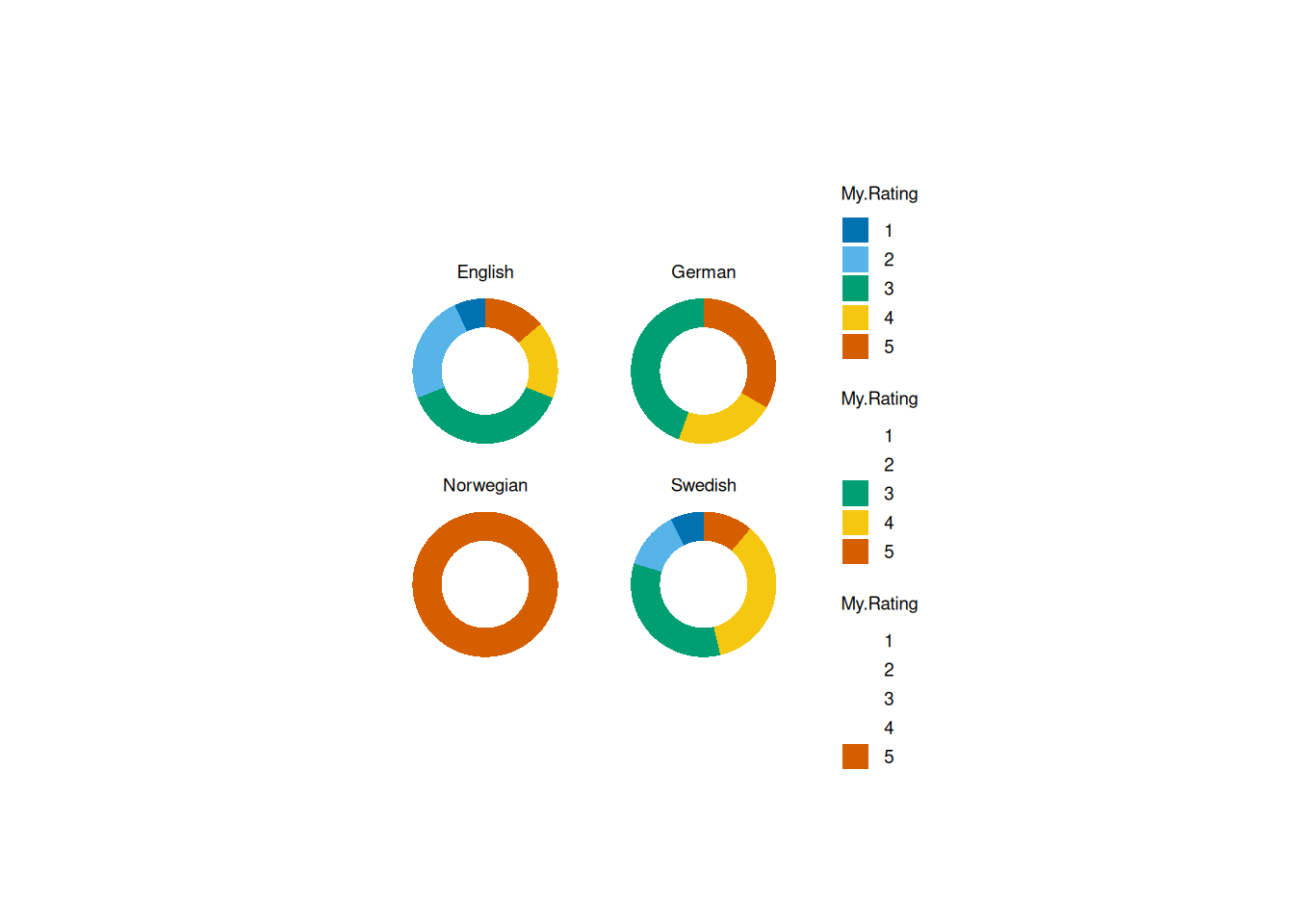
One issue with this approach is that each subplot comes with its own legend, which feels redundant. I’d much rather have a single shared legend, but unfortunately, I couldn’t find a way to remove the extra ones.
When the x-axis labels start to overlap - especially with longer text - we can improve readability by rotating them using adjust_x_axis():
books2024 |>
    mutate(My.Rating = factor(My.Rating),
           Original.Publication.Year = if_else(is.na(Original.Publication.Year), Year.Published, Original.Publication.Year),
           Original.Publication.Year = factor(Original.Publication.Year)) |>
    tidyplot(x = Original.Publication.Year, colour = My.Rating) |>
    add_barstack_absolute() |>
    reverse_color_labels() |>
    adjust_legend_title("Rating") |>
    adjust_x_axis(rotate_labels = TRUE) |>
    adjust_x_axis_title("Publication year") |>
    adjust_size(width = 150, height = 100)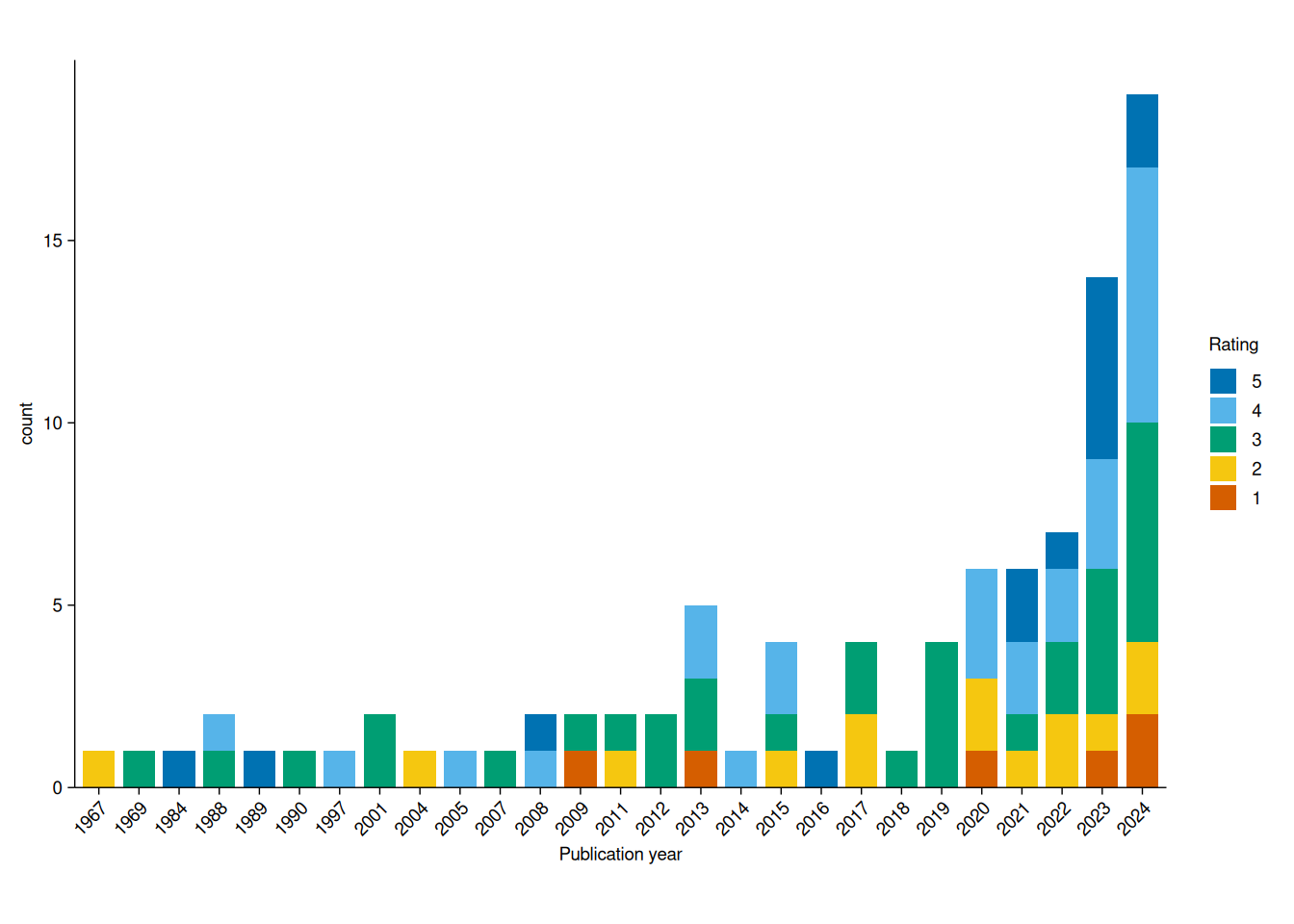
Pretty neat, and definitely more intuitive than ggplot2’s theme(axis.text.x = element_text(angle = 45)).
Boxplots with p-values
A common type of plot in scientific papers displays boxplots for different groups, often annotated with p-values for pairwise comparisons (e.g., from a t-test or a Wilcoxon-Mann-Whitney test). In tidyplots, adding these p-values is straightforward with add_test_pvalue(), which defaults to Welch’s t-test:
books2024 |>
    filter(Language != "Norwegian") |>
    tidyplot(x = Language, y = My.Rating, colour = Language) |>
    add_boxplot() |>
    add_test_pvalue(hide_info = TRUE) |>
    remove_legend() |>
    adjust_size(width = 150, height = 100)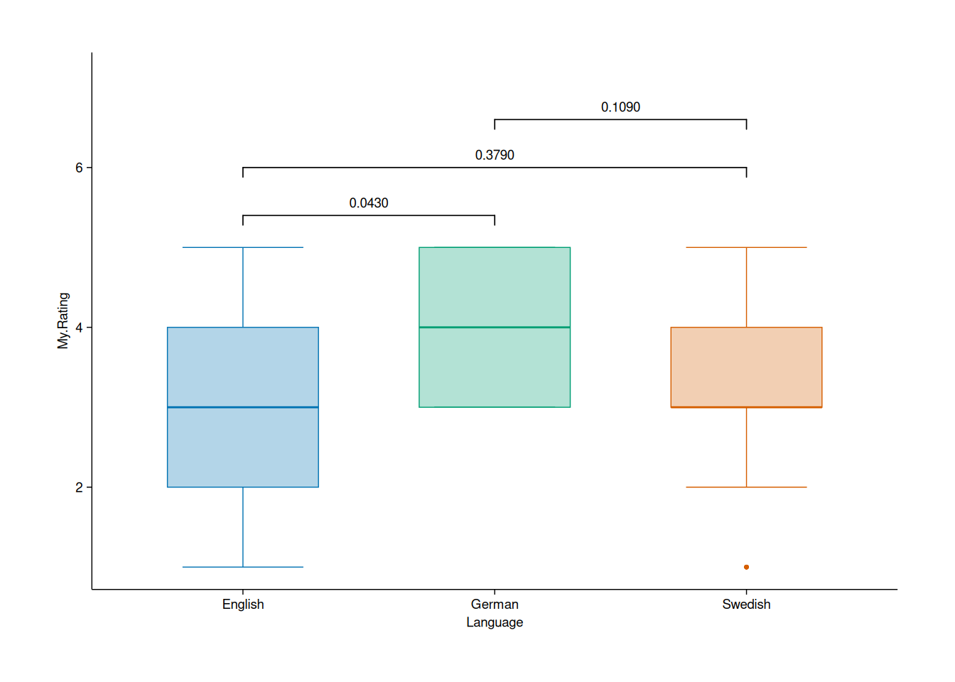
Apparently, German books are significantly better than English ones. The p-values is less than 0.05, so it must be true!
Jokes aside, I really like how easy it is to generate this kind of plot. This should save a lot of time in the future.
Scatterplot: comparing my ratings to Goodreads
What about scatterplots? These can be created with add_data_points(). Here, I’ll plot my ratings against the average ratings on Goodreads, highlighting books I enjoyed substantially more than the average reader:
books2024 |>
    tidyplot(x = Average.Rating, y = My.Rating) |>
    add_data_points() |>
    add_data_labels_repel(label = if_else(My.Rating -Average.Rating>1, Title, NA),
                          color = "black",
                          min.segment.length = 0) |>
    adjust_x_axis_title("Average Goodreads rating") |>
    adjust_y_axis_title("My rating") |>
    adjust_size(width = 150, height = 100)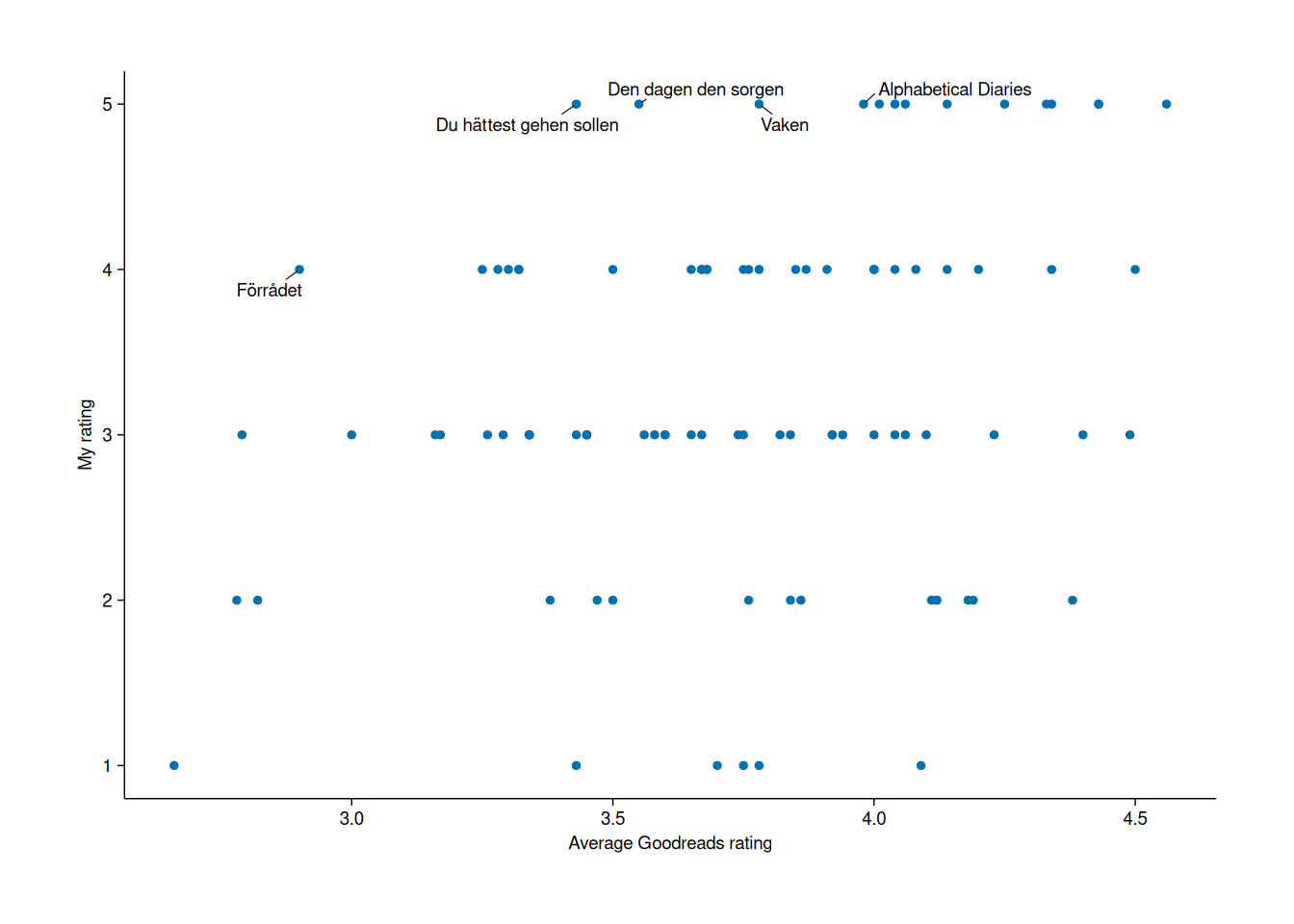
Tracking my reading progress
Lastly, I wanted to visualize my reading progress over time - specifically, how many books I had read by different dates throughout the year. Ideally, I’d use a step function, but since I couldn’t find one, a regular line plot will have to do:
books2024 |>
    mutate(Date.Read = as.Date(Date.Read)) |>
    arrange(Date.Read) |>
    mutate(`Books read` = cumsum(My.Rating > 0)) |>
    tidyplot(x = Date.Read, y = `Books read`) |>
    add_line() |>
    adjust_size(width = 150, height = 100)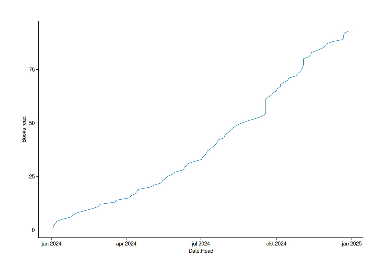
Final verdict
tidyplots is definitely a package that I’ll add to my toolbox. It feels like a modern, streamlined version of ggplot2, with a less cumbersome syntax that relies on pipes instead of the + used in ggplot2 (which, for the record, isn’t going away anytime soon). I disagree with some of the design choices, for instance the tiny default plot size and the syntax for changing axis titles (to me, something like adjust_axis_titles(x = "New x title", y = "New y title" would be preferable to adjust_x_axis_title("New x title") |> adjust_y_axis_title("New y title")), but overall I quite like the way tidyplot works. At times - like the multiple legends in my split doughnut plot - it’s clear that the package is still very much a work in progress. But for the most part, it works really well.
That being said, I don’t see it replacing ggplot2 as my default plotting tool just yet. The latter still offers more features, and remains the better choice for some of the plots I use most often. It’s also worth noting that tidyplots is at least partially compatible with ggplot2, so it should be pretty easy to mix and match them as needed.
As for my 2024 reads, I’m sure you’re dying to know what my favourites were. So to round this post of, here’s my top 10:
- Den dagen Nils Vik døde by Frode Grytten
- The Remains of the Day by Kazuo Ishiguro
- Prophet Song by Paul Lynch
- Lichtspiel by Daniel Kehlmann
- Alphabetical Diaries by Sheila Heti
- The Octopus Man by Jasper Gibson
- Den dagen den sorgen by Jesper Larsson
- The Maniac by Benjamín Labatut
- Om uträkning av omfång 4 by Solvej Balle
- Radio Sarajevo by Tijan Sila