When learning linear regression, many people struggle with model diagnostics - especially interpreting residual plots. We often teach that visual diagnostics are better than test-based diagnostics (and they are!), but it can take a long time to develop a feel for what residual plots “should” look like.
And that’s the problem. Residual plots are essential for checking assumptions like homoscedasticity and normality. They’re easy to generate. They are not always easy to interpret - but it just got easier. In the latest release of the nullabor package, now on CRAN, we included a new function designed to make residual plot interpretation more intuitive.
In this short tutorial, I’ll walk you through four types of residual plots, how to interpret them, and give some advice on what to do if your model assumptions don’t hold. The examples require version 0.3.15 or later of nullabor.
A linear model
For this example, we’ll use the mtcars data, describing fuel consumption for a number of cars:
We’ll fit a linear model with fuel consumption as the response variable and horsepower, weight, and the number of cylinders as predictors (with number of cylinders as a categorical variable):
mtcars$cyl <-factor(mtcars$cyl)m <-lm(mpg ~ hp + wt + cyl, data = mtcars)
We can get p-values and confidence intervals for the regression coefficients using confint(m) and summary(m). But we can only trust the results of those methods if the models assumptions are met. That’s why we need to perform model diagnostics.
Homoscedasticity: the random errors all have the same variance.
Normally distributed random errors.
We can check all three using residual plots.
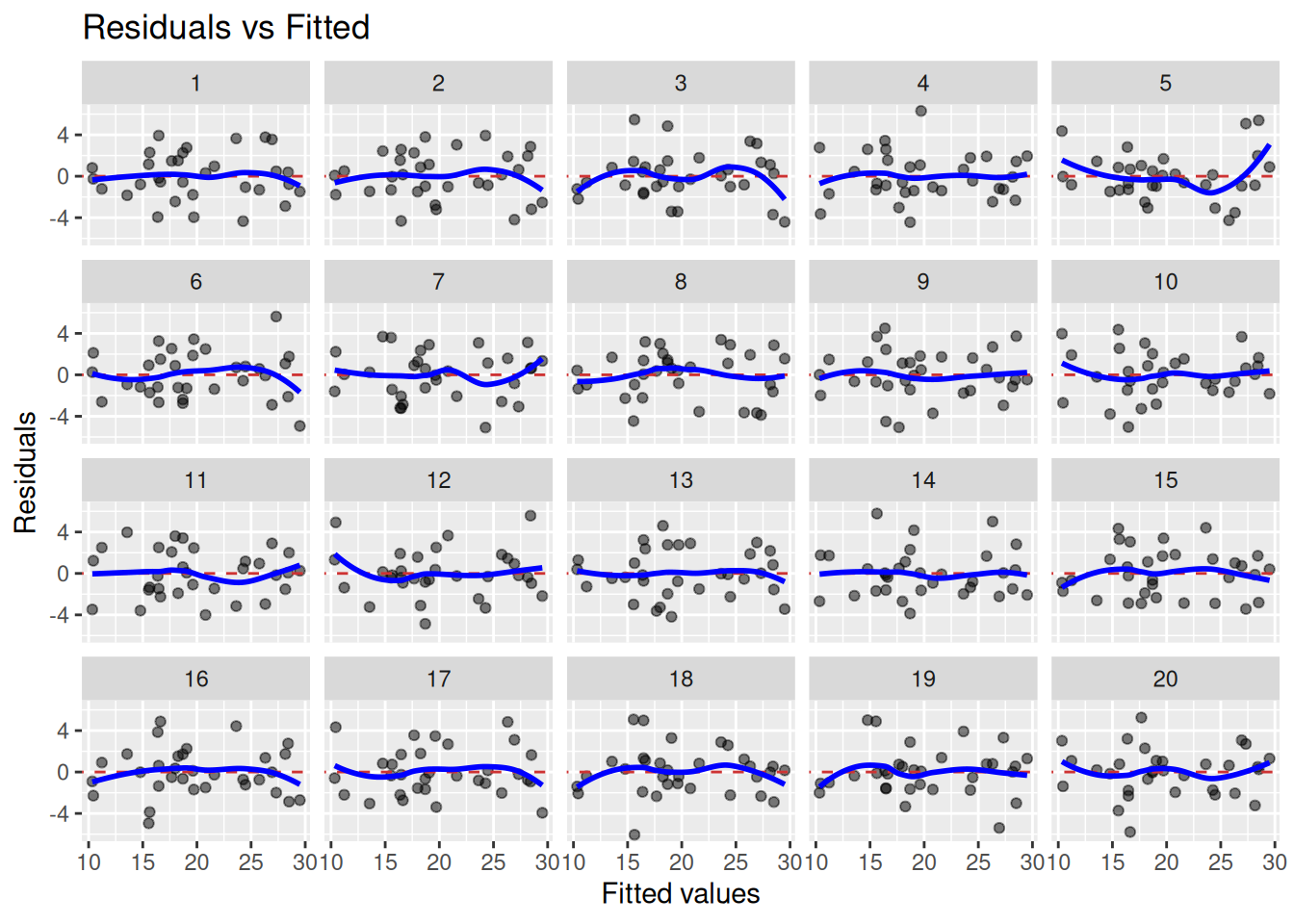
Assessing linearity
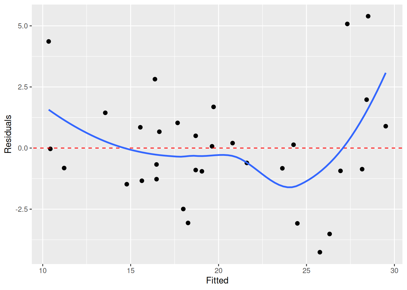
We check linearity by looking for non-linear patterns in the residuals. To do this, we typically plot the fitted values against the residuals. In this plot, as I write in Modern Statistics with R, we “look for patterns that can indicate non-linearity, e.g., that the residuals all are high in some areas and low in others. The blue line is there to aid the eye – it should ideally be relatively close to a straight line”. Here’s the plot for our model:
The blue line deviates a bit from the dashed red line, which could indicate non-linearity. But does it deviate enough? How much can it deviate if the true pattern is linear?
To better be able to assess this, we can use lineup_residuals from the nullabor package. It creates a “lineup plot”, combining 20 residual plots: one plot for our model and 19 plots for data generated under the null hypothesis of linearity. If we see a plot that deviates from the rest, and that plot happens to belong to our model, we have evidence for non-linearity. If not, the residual plot for our model is indistinguishable from residual plots for data where the linearity assumption holds, and we have no evidence for non-linearity.
Here’s how to create the lineup plot:
library(nullabor)lineup_residuals(m, type =1)
In this case, plot number 5 looks a bit off. But which plot belongs to our model? When we run the code above in RStudio, a message is printed in the Console. In my case, the message was decrypt("Pime gvGv DY FbKDGDbY UR"). Running this will print information about in which plot the residuals for our model is shown:
decrypt("Pime gvGv DY FbKDGDbY UR")
[1] "True data in position 5"
I thought that plot 5 was different from the others, and it turned out that this was the plot for our model. This means that we have evidence for non-linearity here. We can consider using a different model (perhaps some type of non-linear regression), adding more terms (e.g. quadratic terms or other predictors), or transforming our variables.
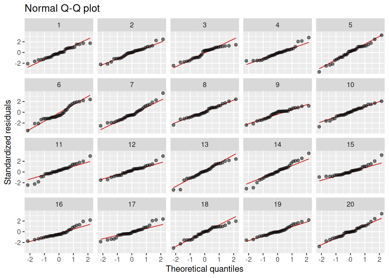
Assessing normality
The normality assumption is important for p-values and confidence intervals to be valid, particularly in cases like ours, where the sample size is small. Normality is usually assessed using Q-Q-plots. If the residuals are normal, the points in the plot should follow a straight line. Some deviations in the tails are OK though. Too see how much deviation we can expect, we do a lineup plot, comparing our model to 19 models generated under the null hypothesis of normality:
lineup_residuals(m, type =2)
I don’t think that any of the plots stand out here. Maybe plot 6, which has a bit of a dip in the middle? Our model turns out to be in plot 17 though (which I see by running the decrypt message), so there is no evidence of non-normality here.
If you don’t have normal residuals, I recommend using the bootstrap to compute p-values and confidence intervals. This can be done in a single line of code using the boot.pval package:
library(boot.pval)boot_summary(m, R =9999) |>summary_to_gt()
Estimate
95 % CI
p-value
(Intercept)
35.846
(31.829, 39.894)
<1e-04
hp
−0.023
(−0.046, 0.001)
0.0608
wt
−3.181
(−4.558, −1.737)
<1e-04
cyl6
−3.359
(−6.077, −0.690)
0.0163
cyl8
−3.186
(−7.310, 1.195)
0.1488
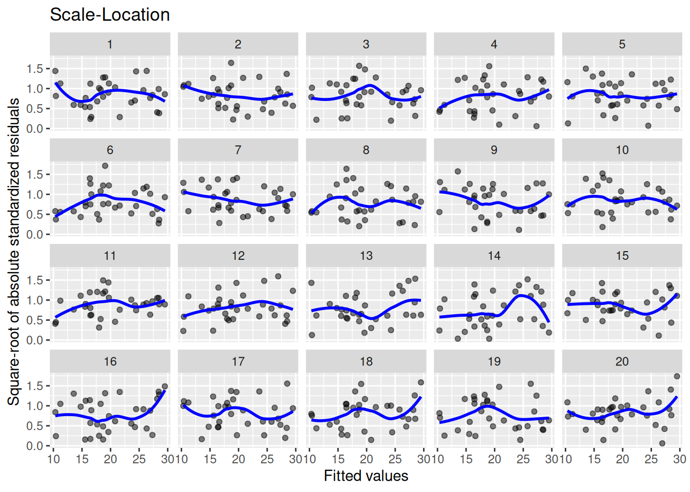
Assessing homoscedasticity
Heteroscedasticity also affects the validity of p-values and confidence intervals. It is assessed by plotting the fitted values against the square root of the standardised residuals. As I write in Modern Statistics with R, we should “look for patterns in how much the residuals vary – if, e.g., they vary more for large fitted values, then that is a sign of heteroscedasticity. A horizontal blue line is a sign of homoscedasticity.” We compare the plot for our model to those for 19 models generated under homoscedasticity:
lineup_residuals(m, type =3)
We see that there’s a lot of variability here. Plots 14 and 16 look particularly strange. Our data is in plot 13 though, so we have no evidence for heteroscedasticity.
If you do have heteroscedastic errors, I again recommend using the bootstrap to compute p-values and confidence intervals. In this case, case resampling is recommended, as this handles heteroscedasticity well:
boot_summary(m, R =9999, method ="case") |>summary_to_gt()
Estimate
95 % CI
p-value
(Intercept)
35.846
(31.386, 41.579)
<1e-04
hp
−0.023
(−0.057, −0.008)
0.0057
wt
−3.181
(−4.903, −1.861)
<1e-04
cyl6
−3.359
(−5.944, −0.764)
0.0124
cyl8
−3.186
(−7.221, 2.385)
0.2516
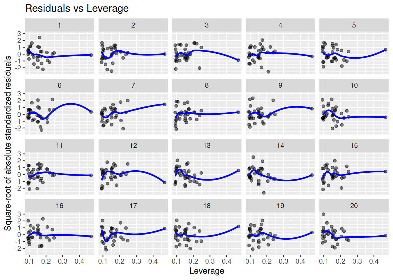
Finding influential outliers
Finally, it is of interest to know whether there are influential outliers that merit further inspection. We plot the residuals against their leverage. Points with a large residual and high leverage have the potential to influence the model fit a lot:
lineup_residuals(m, type =4)
Again, our model (plot 9) does not stand out here. The point with the highest leverage has a small residual, which is a good sign.
Conclusion
It can be difficult to know what “good” residual plots should look like. The lineup_residuals function from nullabor makes things easier by letting you compare the plots for your model to those for models generated under the different null hypotheses. I use lineup plots all the time now, and hope that you will find them as useful as I do. And if you have any suggestions for improvements, please post them at the nullaborGithub page.